
What is Fluent UI & List of Microsoft Products use Fluent UI
Mohammad Afzal Khan
Feb 11, 2021
In the current roadmap, Microsoft is already considering that all its future office applications will use Fluent design in their various UI elements. Future enhancements in Microsoft Teams will also be built using a new collection of icons and colors based on the Fluent UI design. Microsoft also announced that they would use softer colors in application interface design instead of their usual bright colors.
An Immersive experience is critical, and Microsoft aims to be the main focus. Hence, they considered altering their usual traditional design approach for the Fluent Design, and the title brand color has been toned down. As previously announced by Microsoft, instead of using their typical bright colors, they will introduce softer colors like previous application interfaces.
Since Microsoft introduced Windows 10 and Windows 10 Mobile platforms, they focused on its fluent cross-platform design system. They look forward to working with Fluent UI across different product teams and disciplines to deliver more seamless experiences that feel natural on their devices throughout their day.
Introduction:
Fluent UI is a collection of UX frameworks we use to create coherent Microsoft 365 experiences. It's a shared code base of components that include best-in-class accessibility, globalization, and Fluent Design guidance out-of-the-box.
Microsoft designs and digital product experiences are being built internally and with our customers and community using Fluent.
- Natural on every device: Fluent experiences listening and adaptability. Every device people use daily, from tablets to laptops, PCs to televisions, experience a natural feel. They maneuver from the office to the living room to virtual worlds.
- Intuitive and Powerful: Fluent experiences adjust as per behavior and intent—they understand and anticipate what is needed. Whether across the world or standing next to each other, they unite people and ideas.
- Engaging and immersive: We translate expression through the physical world. Fluent speaks in the weave and fold of fundamental materials, light, shadow, and spatial dimensions. It feels effortless in the way it communicates.
What is Fluent UI React?
Fluent UI React is Microsoft's official front-end React-based open-source UI framework designed to build experiences that seamlessly fit into various Microsoft products. It enables highly customizable, accessible, robust, and up-to-date components using CSS in JS.
Like other UI libraries, Fluent UI React also provides various React JS UI controls such as Buttons, Dropdowns, Checkboxes, Grids, etc., and other standard components. It also contains other Microsoft controls such as People Picker, Persona, Date Pickets, etc.
You can build more coherent UI experiences across different platforms and the web using JavaScript-based Fluent UI libraries.
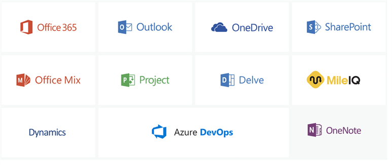
List of Microsoft products that use Fluent UI React:
Below are the Microsoft products which use Fluent UI React:
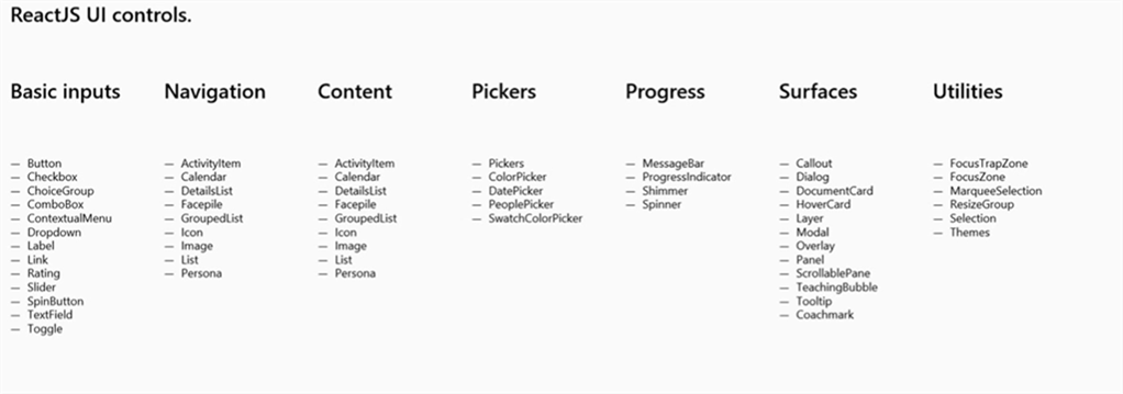
Theme and styling with UI Fabric React:
Fluent UI can also be used with the Fabric Core, which provides some react controls like:
- Input Controls: Button, TextField, Checkbox, Dropdown, ComboBox, ChoiceGroup, Label, Toggle, Slider, SearchBox, SpinButton, Rating, etc.
- Items and Lists: DetailsList, Basic List, ActivityItem, Persona, DocumentCard, Hover Card, etc.
- Galleries and Pickers: Calendar, DatePicker, PeoplePicker, ColorPicker, etc.
- Commands, Menus, and Navigations: Breadcrumb, ContextualMenu, CommandBar, Nav, etc.
- Notification and Engagement: MessageBar, Coachmark, TeachingBubble
- Progress: ProgressIndicator, Spinner, Shimmer
- Surfaces: Modal, Callout, Tooltip, Dialog, Panel, ScrollablePane, etc.
- Utilities: Icon, Text, Stack, Separator, Selection, Key tips, MarqueeSelection, Image, etc.
- Experimental: Card
I am fond of:
- The range of in-built components from which to choose. Essential inputs, lists, pickers, menus, surfaces, notifications, and more.
- The easiness of integrating these components in the application.
- The default styling capabilities without any code.
- The flexibility and ability to customize the look and functionality of the components.
- Using CSS-in-JS. I didn't think I would like this as it can be confusing at first and bulk up your file. However, the good thing is- that the component-level independent CSS code to quickly find the CSS code for a component does not add complexity to other CSS in the application.
I loathe:
- Lack of proper documentation and active technical community support.
- The availability of properties on the components is inconsistent. For example, some inputs do not have validation and error-handling properties.
- Due to a lack of documentation, it isn't easy to integrate complex components such as PeoplePicker, details list, etc.
- Customizing some of the components' look and feel is difficult, as documentation is not of much help.
Conclusion:
It is hard to say that Fluent Design will become widespread soon with the current documentation and limitation in the consistency of components’ properties.
Microsoft must create guidelines and strong community support to succeed with Fluent Design. Google and Apple's design concepts have a strong position, making it difficult to compete with them.
However, since the principles of Fluent sound inspiring and promising, it may influence modern UI design if Microsoft continues to develop it wisely.
Subscribe to our Technology Insights


About the Author

How Can We Help You?
Related Posts